When spring comes, it’s time to get a lot of cans of paints then starts re-coloring your interiors of home. Although Spring has come out, it’ll be okay if you want to figure out what colors you’re gonna take for next Spring. In this page, we want to share some ideas on how to choose and to bring the chosen color shades for your interiors. The colors of course are those that could bring the cheeriest nuance of Spring. From colorful/ pops of colors to neutral color shades are provided to meet your need. We also select some natural color shades that seemingly fit the theme related to Spring. From this you’ll definitely find what colors actually you’re looking for.

Blue or light blue are identical with Spring color. These colors visually feel colder but sometimes have some warmth when applied in just low-intense quality. The colors could also bring stunned look.
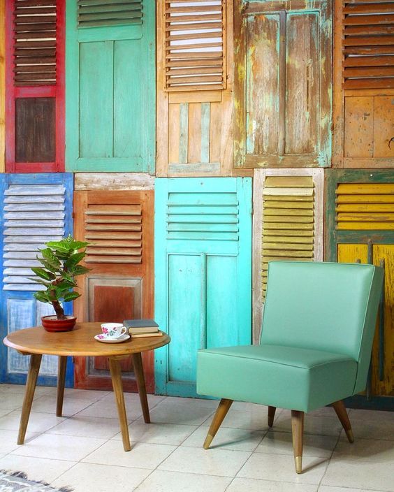
This is called a small living room with classic-vintage style. I personally love the decorative window shutters. They beautifully become an artistic background for the furniture. Just forget the paints; use this idea if you finally don’t find the chosen colors of paint for your Spring coloring project.
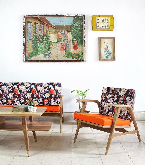
Flowery season with flowery furniture choice – a great idea that meets the theme. Actually this idea doesn’t need to re-colorize some parts of interior like walls, but it’s rather select some ‘nice’ furnishing pieces that meet the theme of decorating. These dark flowery chairs, for instance, look stunning with vivid orange seat-base.

Deep blue is another best alternative for depth and rich of tone reflecting the cheeriest and freshest spring. Use ethnic-colored linens as the complements (for examples area rug and couch’s decorative cover). These pieces of linens could potentially be the direct statement.

So striking with purple. The simplest way to make your living room more fun in look is by furnishing the space with just single bold-colored furniture. This purple loveseat, for example, is able to drive us to keep adoring it.
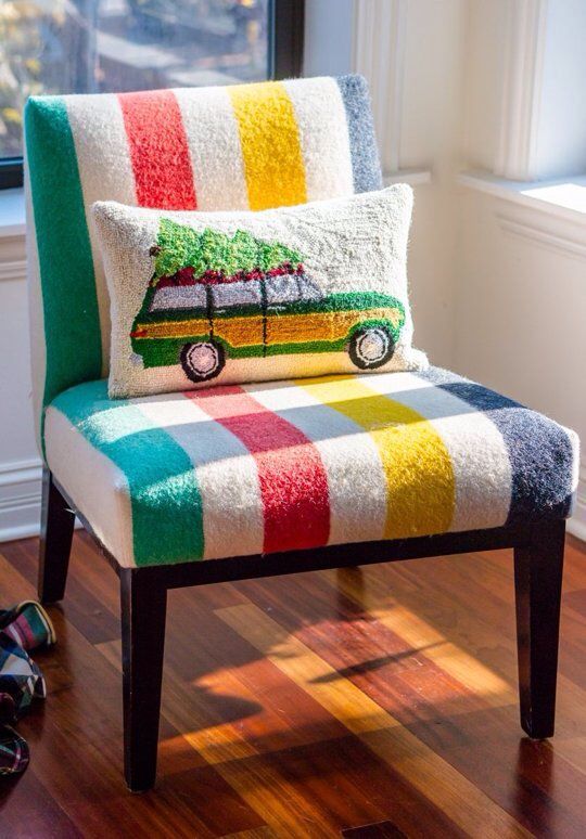
Play with patterns now; just ignore the colors. Feel free to select what pattern you need. Flowery or something floral maybe too boring; but colorful stripes are excellent. Implement this idea into your furnishing pieces and see what you’ve got. Spring has brought the colors back to your home.

Calm, supercozy, stylish, and minimalist with neutral colors. Spring doesn’t always means full of colors; it could be colorless to feel comfortable and peaceful. Like this small living room, it offers the simplest but coziest place for relaxed while welcoming the lovely guests.
Darker tone divers the previous picture; this one is full of depth and richness of dark-neutral tone found in futons. This color shade indirectly leads to more powerful look but still providing ultra-comfort and style. I love the floor-lamp, too. It’s simple yet unique.

Scandinavian style is one of most recommended choices for Spring. Airy and light are the keys to get the simple and minimalist decorating output, so you can collaborate it with any bolds, neutrals, or even natural shades.
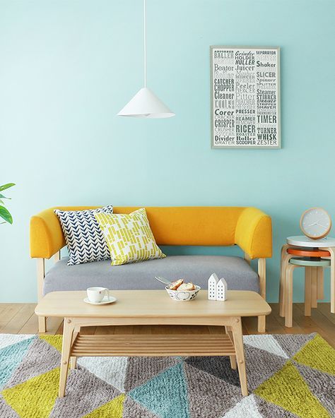
Create a good balance of color. Natural and pops of colors, for instance, could be a good pairing if you want to produce warm-feel space accented with some fun color shades. This tiny living room is finest sample how to add pop of yellow to such light wood furniture pieces. This area rug, additionally, could present a modern touch that makes a room statement.

Interesting; the construction and leather finish are in the same tone but different in texture & material. This creates a unique visualization where we’ve found two different tone mappings: warm-feel due to light wood color in base and colder-feel due to light blue color on top.