Spring is a special season when weather becomes warmer; leaves & plants are starting to grow and flowers are blossoming. Spring also symbolizes a new life with full of joys. Many people get inspired to take this most cheerful season as the theme of home decorating idea; but what we can do during Fall? There is a bit warmth during this season and it’s nice enough to enjoy the airy nuance out there, so it’s okay to start applying a decor refresh to your home. As re-painting home is the easiest way to transform the space, here we would like to recommend the most perfect palettes for a Fall home.
For A Moody British
The following color palettes are inspired by British accents. They’re timeless and able to bring nostalgic moments. Gold and copper in high intense and dark gray are included in this category.
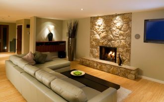
Gold-hearted palette feels so elegant and tasteful. With gold-toned refresh, the black leather furniture looks much contrasted.
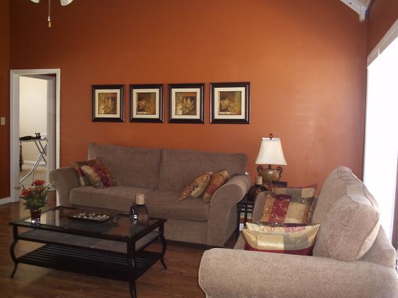
Yes, it’s visually dark. Actually, this is rusty orange but when combined with dark-neutral scheme (like gray), the color becomes bolder; a copper-like tone, isn’t it?
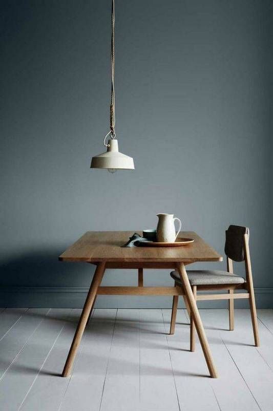
From this color scheme, we all know how the dark gray uses its neutral to transform an edgy room into a tranquil one.
For Bold-Palettes Maniacs
The boldest palettes relatively mean cheerfulness and enthusiastic feeling. Most designers also connect them to these qualities: eclectic and passionate. They love to be active and unique. Importantly, these color palettes really stunning and embrace every detail of color beauty. We can also call them as pops of colors presenting lots of positive vibes.
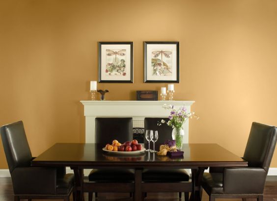
We’ve seen lots of portions of bold color palettes and rusty yellow obviously dominates the frame. To make it best as a match, the designer uses some neutrals nearest that artwork. It works; the painting has been a successful statement.

Calm but wild; this oceanside color scheme would be the best option for beach homes as it express the truly refreshment of ocean breeze. Make wood as best match for warmer-nuance space.

Argyle-green successfully re-creates the existed look. We may also say that this color is flexibly used based on the complementary colors involved. It seems to be lighter when featuring other light and bright palettes, but it would be deeper when other bolder palettes complement it.
Nature-Color Palettes
There are some options of color palettes that bring nature in space. These colors are inspired by terrariums and prints of botany that match with greenery. With this, you’ll easier to apply the nature-color palettes you want such as the color of mushrooms, blossoming flowers, leafy greens, and many others.

Dard Hunter Green will turn to be much bolder if we combine it with bright and light color palettes like white.

Re-feel a bit warmth of Fall by re-painting your walls with this sunset drive scheme. The scheme exposes more on softness and warmth of flowering fruits’ blooms. Its gentle tone of course helps bringing us to good mood and relaxation.
For Earthy Shade of Colors
Earthy shades are dominated by warm and neutral color palettes. They are also inspired by wild safaris, desert oases, and traditions commonly told by the storytellers. These colors speak how they connect to us and amazingly they can change into more modern tones without making their roots disappear.

Red rustic is one of color palettes included in earthy color shades. The visualization is clearly deeper – really matching with any rustic interior items. But here we see a modern touch – gray sofa and rug- perfectly makes the space trendy.
For Futurists

The color palettes seem creative and visionary. The palettes include the blues that amazingly capture a timeless trend of color.